Management dashboards over the digital public-service requests of the Paperless City Hall platform
A reporting module built on Vision DataPulse gives Sector 6 City Hall eight management reports over its digital service requests: volumes by service and department, status and response times, performance, rejections, applicant categories, trends over time and pending requests.
Sector 6 City Hall in Bucharest runs its public services on the Paperless City Hall platform delivered by Vision, where citizens and companies submit requests online: ID card and marriage appointments, civil status transcriptions, operating permits, urban planning certificates, summer kindergarten enrolment, complaints and petitions. As the volume of digital requests grew, management needed a clear and current picture of how these services perform.
Initial Challenges
The request data existed in the operational platform, but each department worked with its own queue. There was no consolidated view across services showing how many requests come in, how long they take, how many are rejected and for what reasons, and where pending requests accumulate.
Producing such a view meant extracting data and assembling it by hand, so figures were rarely fresh and were hard to compare between departments, which did not measure completion and timeliness in the same way.
The Smart Solution
Vision delivered a reporting and analytics module on Vision DataPulse, fed from the data of the Paperless City Hall platform and presented as one dashboard. Department, month and year filters apply across all reports, and every chart and table can be filtered, sorted and explored.
The dashboard is organised as eight management reports:
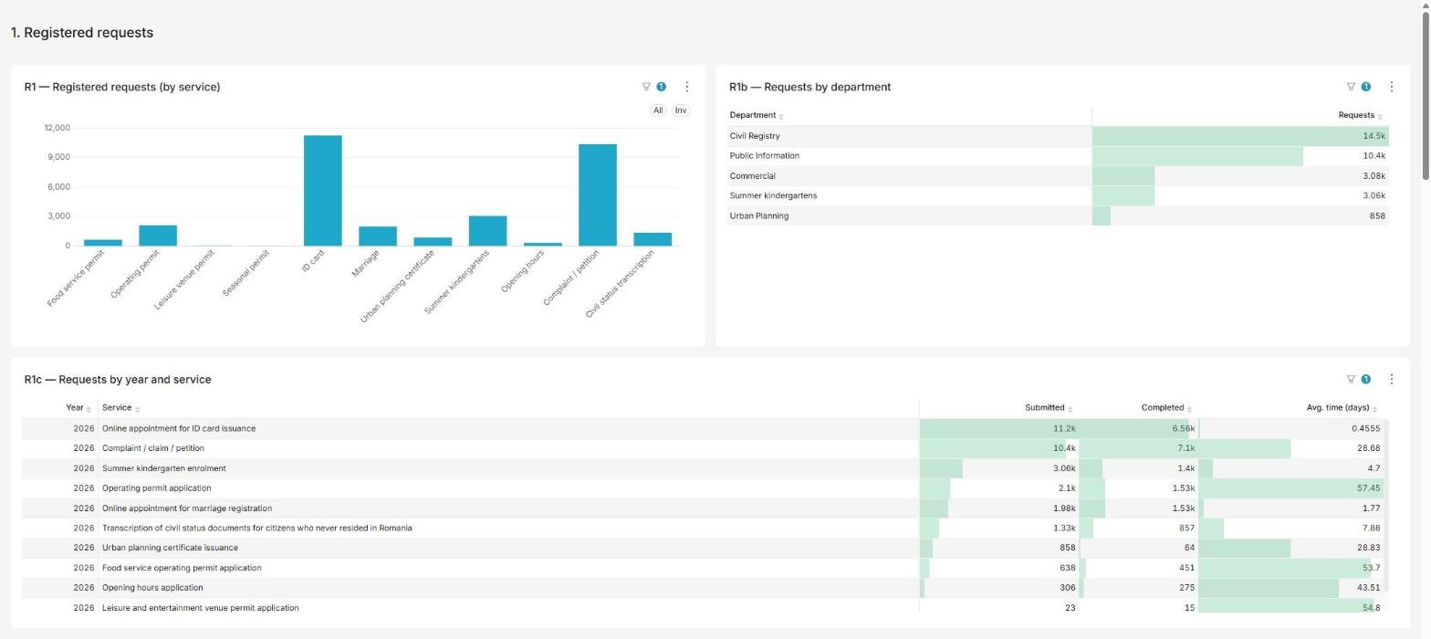
- Registered requests, by service, by department and by year, with submitted and completed counts and the average processing time per service.
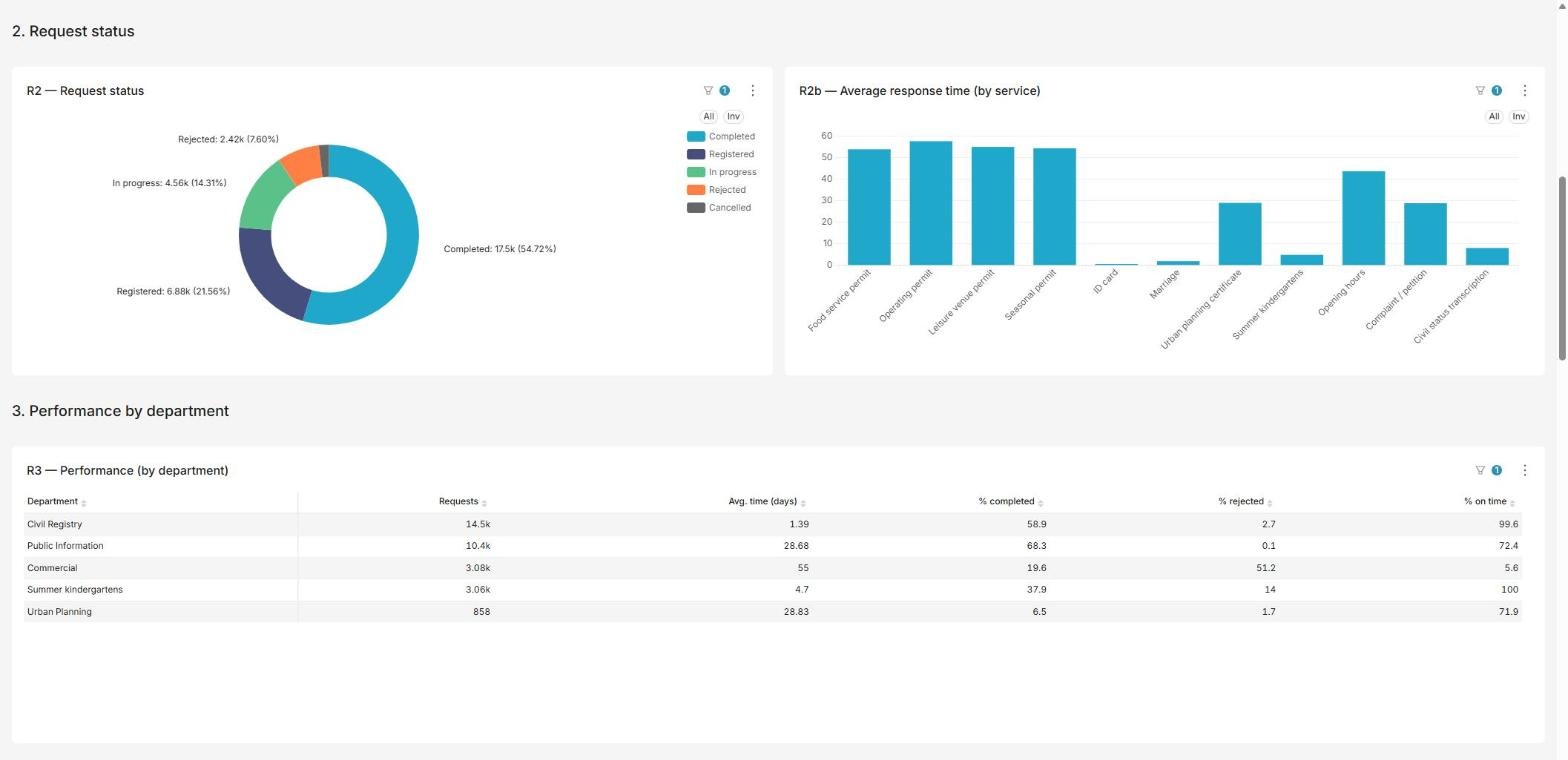
- Request status, the share of requests completed, in progress, registered, rejected or cancelled, and the average response time per service.
- Performance by department, number of requests, average time, percentage completed, rejected and resolved on time.
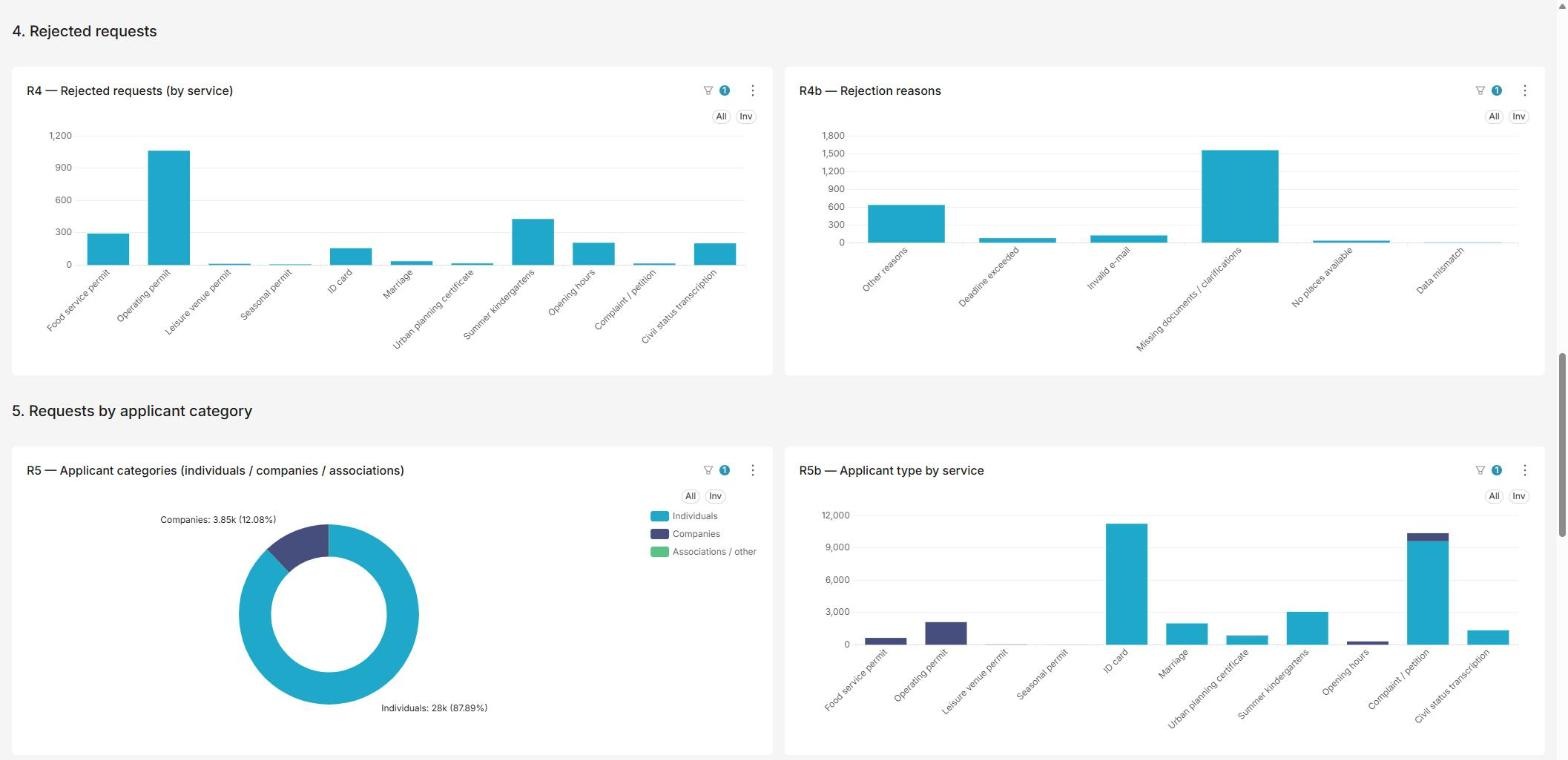
- Rejected requests, by service and by rejection reason, such as missing documents or clarifications, data mismatch, invalid e-mail or deadline exceeded.
- Applicant categories, individuals, companies and associations, overall and per service.
- Geographic distribution, reserved for a later stage: request addresses are stored differently per service and are not yet geocoded, so the report is marked as unavailable rather than built on incomplete data.
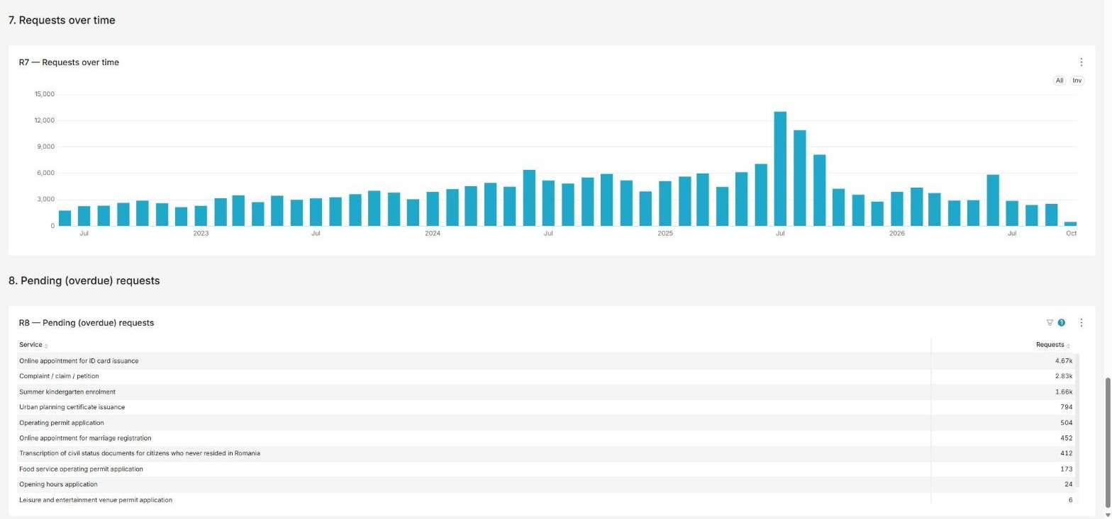
- Requests over time, monthly volumes across several years, which makes seasonal peaks visible.
- Pending requests, the current list of overdue requests per service.
The same definitions of status, completion and timeliness are used in every report, so departments can be compared on equal terms.
Implementation Insights
The reports were derived from the questions management asks, rather than from the tables available in the database. Most of the work was in the data layer: services record their requests differently, so processing time, status and timeliness had to be defined once and applied consistently across all of them.
Where the data could not support a reliable report, as with the geographic distribution of requests, the dashboard says so explicitly and the topic was documented as a separate follow-up, instead of showing a map that would be misleading.
Results & Impact
The city hall now has one consolidated view of how its digital services perform.
Operational Results:
- Consolidated view. All services and departments appear on one dashboard with shared definitions.
- Pending requests in sight. Overdue requests are listed per service, so coordinators know where to intervene.
- Rejection analysis. Rejection reasons are quantified per service, pointing to forms and guidance that need improvement.
- Less manual reporting. Figures come from the platform data, not from hand-built spreadsheets.
Business Results:
- Fact-based management. Decisions about staffing and process changes can rely on measured volumes and processing times.
- Comparable departments. Indicators such as the share of requests resolved on time are calculated the same way everywhere.
- Seasonal planning. Multi-year trends make recurring peaks, such as summer kindergarten enrolment, predictable.
- A basis for transparency. The same figures can support reporting on service performance to the public.
Lessons Learned & Key Takeaways
A reporting project stands or falls on definitions. Agreeing what counts as completed, on time or rejected, and applying it uniformly, mattered more than any visualisation choice.
Being explicit about what the data cannot yet support kept trust in the numbers that are shown, and building the module on the operational platform means that new services added to the Paperless City Hall become reportable with little extra work.